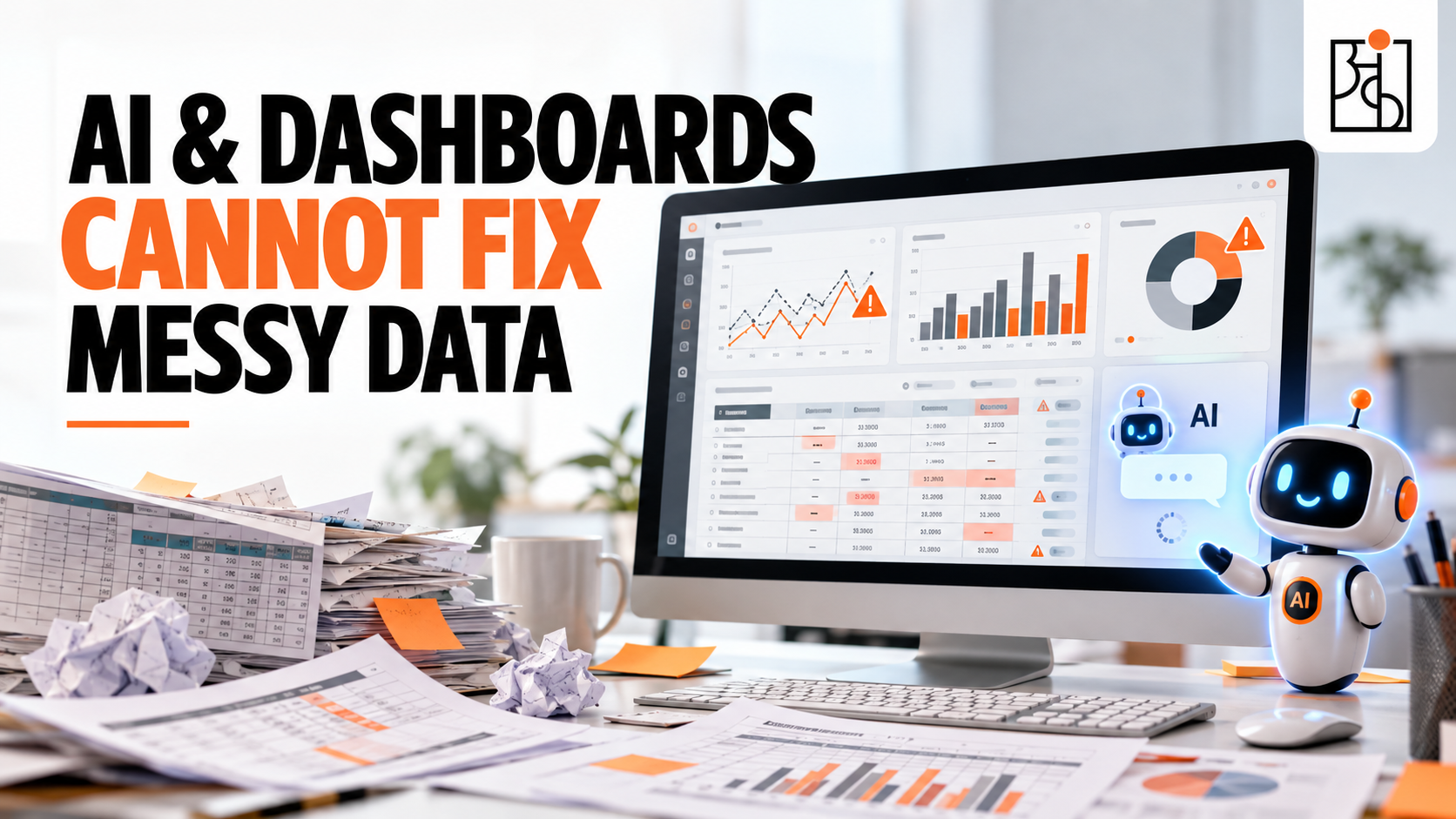
AI & Dashboards Cannot Fix Messy Data
Data Quality in AI is essential for making accurate business decisions, generating reliable reports, and building trust in automated systems. Many organizations believe that AI tools and real-time dashboards can automatically detect and correct inaccurate data. However, even the most advanced AI systems can produce misleading insights when they rely on incorrect entries, inconsistent formats, missing values, or mismatched units. Understanding the importance of data quality in AI helps businesses prevent costly errors and make better decisions.
Table of Contents
What AI and Dashboards Actually Do (And What They Don’t)
Here’s the part that’s easy to lose track of in the middle of genuinely impressive demos and product launches: every single one of these tools, no matter how advanced, processes exactly what it’s handed. Not what you meant to give it. Not some sensible, auto-corrected version of it. Exactly what’s actually sitting in that field, that cell, that row.
A monitoring platform doesn’t stop to ask whether a digester depth of 7,000 meters sounds physically possible for a piece of industrial equipment. An AI model summarizing a dataset has no idea a date column switched formats halfway down, or that “Site Alpha” and “site alpha” were typed in by two different people and are now being read as two completely different locations. None of that gets quietly caught and fixed behind the scenes — not unless someone specifically built a check for that exact problem ahead of time.
What actually happens instead is almost too simple to sound like the full story, but it is the full story: raw, messy data — mixed date formats, swapped units, missing fields — goes in one end. A dashboard or an AI model processes it exactly as given, no magic involved anywhere in the pipeline. And what comes out the other side is a confidently wrong decision, dressed up as a clean, professional, completely trustworthy-looking report.
Why This Is More Dangerous Than an Obvious Mistake
A messy spreadsheet, full of inconsistent fonts and obvious red flags, tends to make people cautious almost on instinct. Something about it visibly says “double-check this before you trust it.” A polished dashboard does the exact opposite. It signals “this has already been processed, verified, cleaned up — you’re fine to trust this,” even in situations where absolutely nothing about the underlying numbers was ever actually checked.
That’s the real trap here. Leadership teams lean on dashboards precisely because they’re supposed to simplify a decision — take a tangled mess of operational data and boil it down to a few numbers someone can act on quickly. If the sanity of the input feeding that dashboard was never verified, the dashboard doesn’t magically correct for that gap on its own. It just presents a false picture, formatted beautifully enough that nobody thinks twice about questioning it.
This is really the uncomfortable heart of what people call the AI and automation trap: the better a tool looks, the more blind trust it tends to earn — and the less likely anyone is to go back and actually check whether the numbers feeding it were ever sound to begin with.
A Concrete Way to See This Play Out
Picture an ordinary shift log at an industrial site — feedstock input, digester level, pH readings, runtime hours, jotted down a few times a day by whoever happens to be on shift. Nothing about it screams “high stakes.” It looks like routine paperwork, the kind of thing filled in quickly between actual tasks.
Now say one entry in that log records feedstock as 20,000 in a field meant to track tons, when the real figure should’ve been closer to 20 — one misplaced decimal, sitting quietly in an otherwise unremarkable row. A monitoring dashboard connected to that log has no way of knowing this number’s implausible. It just displays it, scaled a thousand times past reality. A broader analytics system watching for odd patterns across sites flags this as an anomaly — not because anything unusual actually happened on the ground, but because the input it received was already broken before it ever got there.
By the next day, this one entry’s already shaping real decisions — tomorrow’s targets for solid removal, for water addition, built on a number that was never accurate in the first place. Nobody manually typed in a bad decision. The dashboard didn’t lie out of malice. It just did exactly what it was built to do, which is process whatever input it receives — and this time, the input happened to be wrong.
Or take a completely different kind of example, this time from HR instead of operations. A reporting manager’s ID field gets left blank, or someone types “N/A” instead of an actual name. An automated performance review workflow depending on that field simply never fires. No review starts. No error message explains why. The failure stays invisible until someone eventually notices a review never happened, then spends hours tracing it back to one missing value that should’ve taken two seconds to fill in correctly the first time around.
In both cases, the technology worked exactly as it was supposed to. The automation did precisely what it was told. The actual failure happened earlier, right at the point of entry, somewhere no dashboard was ever going to catch it.
When This Scales Up, the Stakes Get Real
It’s tempting to assume this kind of thing stays contained to small operational hiccups — mildly annoying, never genuinely damaging. A handful of well-documented cases from major organizations say otherwise, and most of them involved tools and processes that were, by any reasonable standard of the time, considered pretty sophisticated.
Company A, a space agency, lost a spacecraft worth roughly $125 million because one engineering team’s software reported thrust data in pound-force, while the navigation team’s systems were expecting the number in newtons. No dashboard anywhere caught that mismatch before the orbiter dropped too low into a planet’s atmosphere and was destroyed.
Company B, a securities trading firm, watched a trader’s plan to sell a single share at a high price turn into an order for hundreds of thousands of shares at a fraction of that price — more shares, actually, than the company had ever issued. The automated trading system processed the order exactly as entered. It had no way of knowing the number was absurd; it just executed it.
Company C, a major retailer trying to pull off a large international expansion, ended up writing down billions of dollars and shutting well over a hundred stores, partly because product data for tens of thousands of items had gone in with no consistent standard — inches mixed with centimeters, currencies mismatched. The systems sitting on top of that data didn’t flag any of it. They just processed it, same as always.
Company D, a global financial institution, traced part of a multi-billion-dollar trading loss back to a risk model running on manually assembled spreadsheets, where one formula used SUM instead of AVERAGE — quietly slicing the reported risk roughly in half. The model had no idea the formula was wrong. It calculated exactly what it was told to calculate.
In every single one of these, the technology involved wasn’t primitive or careless by the standards of its day. It just did precisely what sophisticated systems do — process whatever input they’re given, without independently checking whether that input actually made sense.
So What Actually Closes This Gap?
Not a smarter dashboard. Not some more advanced AI model stacked on top of the existing mess. The fix has to happen earlier than that — right at the point where data first enters a system, before any tool downstream ever gets the chance to inherit a problem it was never built to catch.
A handful of pretty unglamorous habits do most of the actual work here. Build the unit straight into the field itself — a field simply labeled “Feedstock” invites a guess; one labeled “Feedstock_In (T)” doesn’t leave room for one. Set realistic bounds for every parameter, and build them right into the entry form — a digester level that can only be entered between 0 and 10 meters, a pH value locked to the 0–14 scale, a runtime figure that physically can’t exceed 24 hours in one day. A system that rejects an obviously impossible number right at entry never gets the chance to quietly hand that number off to a dashboard that’ll treat it as gospel.
Standardize formats so small variations can’t quietly multiply into separate records — one consistent date format across the board, a dropdown of valid site names instead of a free-text box where “Site Alpha” and “site alpha” become two different locations as far as the system’s concerned. And give every field a clear owner — someone who knows exactly what format’s expected, who makes sure everyone actually entering data knows it too, and who checks in periodically that it’s being followed, rather than just assuming it’s fine because nothing’s obviously broken yet.
None of this needs complicated new technology bolted on top of what already exists. It just needs treating the moment of data entry like something that actually matters — because every automated system sitting on top of it, however advanced, is only ever going to be as trustworthy as that first, often rushed, often completely overlooked moment.
The Actual Takeaway
AI and dashboards are genuinely powerful, and none of this is an argument against using them. The point’s narrower than that. They were never designed to independently check whether the information feeding them actually makes sense in the real world — and expecting them to quietly do that job anyway is exactly how a wrong number ends up driving a real decision, dressed up to look trustworthy.
This is pretty much the gap Ankashram’s data culture work is built around closing — not by promising some smarter piece of software that solves everything for you, but by building the habits at the source that make everything downstream actually trustworthy in the first place. A dashboard can only ever be as honest as the data somebody handed it. Everything past that point is just good formatting.
Frequently Asked Questions
Q1.Can AI actually detect and fix bad data on its own?
Not reliably, no — not unless it’s been specifically built to check for a particular kind of error ahead of time. AI tools process whatever data they’re given; they don’t independently know a number’s implausible or a unit’s wrong unless that check was deliberately designed in.
Q2.Why is a wrong dashboard more dangerous than an obviously messy spreadsheet?
Because a messy spreadsheet visibly signals caution on its own — something about it looks untrustworthy, so people tend to double-check it automatically. A polished dashboard does the opposite. It looks processed and verified, so it earns trust even when the underlying data was never actually checked, which makes a confidently wrong report far more likely to slip by unquestioned.
Q3.Where should data quality actually get managed — at entry, or in the dashboard?
At entry, pretty much always. Cleaning up bad data after it’s already flowed into dashboards and automated systems is a lot harder than just preventing it in the first place. Building checks like unit labeling, valid ranges, and standardized formats straight into the entry process stops errors before they ever get the chance to spread.
Q4.Are these kinds of errors only a risk for huge, complex organizations?
Not at all. The same mechanics hold at any scale — a small business’s spreadsheet is just as capable of feeding a wrong number into a decision as a multinational’s trading system is. The famous cases involving massive financial losses just show what happens when the same ordinary mistake lands inside a system big enough to amplify it.
Q5.What’s the simplest first step a team can actually take to prevent this?
Naming an owner for every important data field — someone responsible for defining the expected format, telling whoever enters the data what that format is, and checking in periodically that it’s actually being followed. It’s a basic habit, not some technical fix, and it tends to catch more than people expect.